Showing posts with label inspiration. Show all posts

Wednesday, March 21, 2012

Canadian House & Home – April Roundup

CoverThe April issue of Canadian House & Home has to be my favourite to date. It’s got the most gorgeous interiors! Every time I thought I saw something absolutely beautiful, I’d turn the page and see something even better. It’s like this issue was made for me!

The next few pictures are of the lounge by Piero Lissoni from the International Design Show, which took place at the Metro Convention Centre in Toronto in January. The West Elm display was very popular with a lot of bloggers, but this was by far my favourite display. In this article, Linda Reeves said this was Best of Show for her too. What draws me to the room most are the light colours and feelings on airiness. Some details that I love are the super tall bookshelves, the couches, the dining table, and chandelier.
Piero Lissoni - IDS Show 2012 
Piero Lissoni - IDS Show 2012, 2
Instagramed! Sitting on the couch in the top photo at IDS

This townhouse is owned by Patricia Lovett-Reid and designed by Lisa Rogers. I really like that the high ceilings and light walls are grounded by the rich darker hardwood floors. The furniture is very streamlined as well, giving the space a more modern feel. The over-sized art above the console in the dining room is a great addition to the space and I love the built-in look of the desk. Also, check out the circle window! That's an awesome detail.
Open Concepts Living Diving Room
Open Concepts - Dining Room artDesk nook

This Scandinavian-design inspired condo is owned by Tom and Catharina MacMillian and was designed by Anne-Marie Fleming of Boxwood Architects and Jill Greaves. Not to sound crazy, but this living room looks delicious. Like drool-worthy delicious. I just want to pick it up and plunk it down in our condo. I want to list what I love, but let's just say it's everything. Literally everything. Ok, well I'll list a few things: I love how bright the space is. I love the scale and colour of the sectional... although I'm a slob and would never be able to keep that clean. I love the round simple coffee table. The art in the corner... and the touches of wood throughout the space - the chair, the side table. And in the bedroom I love the built-in headboard. I go gaga for a good built-in and this one is awesome.
A New Beginning
A New Beginning Bedroom
This home is owned by Byron Peart and Stefan Weisgerber and designed by Richard Keyes from Bulthaup Toronto. I love the European white oak herringbone floors and the glass banister leading up the glass half wall upstairs. It's such a great way to open up the space and let the light in.
Just when I thought I couldn't like the space any more, I see the next picture, which shows a dramatic black feature wall with a framed Hermes scarf for art and a slatted footbridge that wraps around the upper perimeter of the room. To. Die. For. 

A Tale of Two Kitchens
A Tale of Two Kitchens 1

This minimalist Scandinavian-design custom-built home is owned by Katherine Yaphe and was designed by Richard Wengle. I love the chairs (they're from Formstelle Morph Lounge chair, Avenue Road). The silhouette is great, as are the legs and the fabric. I also really like the wide planks on the floor and the floating console in the dining area.
Sight
Sight - dining room 
Did you love this issue of House & Home as much as I did? Seriously, this has got to be my favourite issue to date!

Thursday, February 23, 2012

CB2

I recently ventured to CB2, Crate&Barrel's younger, hipper, and (relatively) cheaper counterpart. CB2 opened their first Canadian store at Queen and Bathurst in Toronto on January 20, 2012. The 2-story store is actually a heritage building that was built in the 1800s. Most Torontonian's are familiar with the building in its previous state - purple, and lots of it. CB2 spent $3 million restoring the exterior of the building to its original beautiful state, which involved stripping the brick of the purple and gutting the interior, but they did keep a few pieces of nostalgia, most notably The Big Bop sign hanging in the stairway to the second floor (you can see it on the top right photo)
Photos sources clockwise from top left: 1/2/3/4
The store was packed when I visited and was stocked full with new spring 2012 collection. There were lots of bold colours as well as neutrals to round them out, and I noticed a pretty heavy Scandinavian influence - simple lines and natural woods.


Here are a few items that caught my eye:

I loved these plates - the salisbury steak one for my meat-loving man, and the tofu steak one for me :) The white bookshelf is also great. Kevin and I have been eyeing the Expedit unit from Ikea, but this one has some potential too...


Have you checked out CB2 yet?

Thursday, February 9, 2012

Kitchen Island Potential

I've always wanted a kitchen island. In our last apartment, I really want to get the Utby table from Ikea, which isn't technically an island so much as a table, but I would've used it as an island and put some counter height chairs around it. Kevin nixed the idea because he wanted a tradition 30-31 inch high table...womp womp. In the condo, I think I might be able to swing a small island (Utby, you might be able to come home with me after all!) in addition to a dining table. I'm refraining from buying anything before we move in (heck, the place isn't even built yet), but I spotted this picture in House of Fifty magazine and let me tell you, there was some major swooning going on...

Do you have an island? Or do you wish you had an island, like me?

Photo source: House of Fifty Issue 4 Spring 2012 Pg 24

Thursday, December 22, 2011

Style at Home - January Roundup


This was my first magazine for 2012 to arrive in the mail. I can't believe it's almost 2012. This is the year we'll be moving to our condo (pending no crazy delays!). This issue had some interiors that were just my style. I'm also pinning and blogging the finishes and decor I like so that we can take it to our meeting when we pick our finishes... which should be in January! Eeeek!

This house is a 1900 square foot Victorian brownstone in Toronto's west-end. The homeowner is David Barclay and Jessica Cotton was the designer. I loved this room in particular. David describes his style as a mix between "modern, Victorian and Boroque", which is right on the money. Out of all the rooms in this house, this one is the most modern, and probably why I liked it the best. I love everything from the loud modern art (The "Do You Still Love Me" piece is from Montreal-based artist, Antoine Jouet) to the sectional to the pillows to the Union Jack carpet. 


This 2600-square-foot Vancouver home is owned and designed by Kelly Deck. This house mixes feminine and masculine touches so well and has a great neutral palette with pops of blue. Some design elements that stand out for me in this room are the herringbone-patterned hardwood floor, the narrow-armed sofa, the blue zebra print slipper chairs, and the rustic meets industrial coffee table. 

Here we have a few more narrow-armed sofas. This style looks so much more modern to me, but still has a traditional edge with the tufting. For those living in tighter quarters, a narrow-armed sofa is a better use of space  - the arms don't intrude on the overall size so you get more seat space for less floor space. I like the "medium" Style Garage one the best!

I'm not kidding when I say I spent a good hour looking at these photos and reading the recipes. I kept saying, "Kevin, doesn't this look good??" or "Wouldn't this be nice for a casual dinner with some of our couple friends??" I even really like the dishes! Navy blue, gray and yellow... so pretty!

I saw this Canadian Tire ad. I think it's advertising the panini press, but I was drawn in by the kitchen! This is pretty much what we're going to aim for with the condo: white shaker cabinets, gray-white backsplash, potentially white counters, and wood or laminate floors carried through instead of tile. And the pulls aren't too shabby either!

Kevin and I are leaving today for Florida. We're going on a Caribbean cruise :-). We're driving down to Florida, which may sound a little crazy, but I'm excited because I've only seen NYC and Washington D.C. I might not be as excited on the drive back, but I can't complain! I also intended to do waaaaay more than I could humanly manage before going on vacation (hence the lack of posting this week), and finished almost none of it (still have to do laundry and pack before tonight), but I'd like to wish each and every one of you a safe and happy Christmas and New Year!

Take care and best wishes for 2012!!!

Thursday, December 15, 2011

My Christmas Decor Inspiration

Christmas decorations are so varied. Some people stick with simple whites, silvers, and golds, while others will use practically every colour under the sun. I grew up with my parents decorating the house with a real tree, multi-coloured lights outside and in, wreaths, garlands, tinsel, Santa figurines... you name it, we had it. I guess you just kind of accumulate a lot over the years and probably go for it a little more, decoration-wise, when you have young kids who still believe all the magic that Christmas brings. By the way, the jig was up when I was 8 and I saw my parents in the living room wrapping presents. They weren't even trying to be sneaky anymore! Seriously, I'm so gullible, they could've kept that charade going for at least a few more years...

Anywhooo, I thought I'd share some inspiring Christmas decor images that I found on Pinterest :-) My style is definitely falls into the more subdued, maybe even abstract side of Christmas decorating.

Tree:
If I had to have a traditional tree (be it real or fake - I have no preference), I'd decorate it like this. I love the white and silver decorations, the sheepskin rug underneath, the green and white palette for the wrapping paper. I even love how the tree seems kinda droopy
[via]

If I didn't have the space and Kevin didn't object, I'd do something like this. I love the simplicity of it!
[via, clockwise from top left 1,2,3,4]

Wreaths:
I love wreaths. When I see one on someone's front door, it kind of sets the tone for what I should expect for the interior decor. Here are some non-tradition wreaths I scoped out:
[via 1,2,3,4,5]


General Decor:
All the other little touches around the house are what help to create that Christmas-y feeling.
[via 1,2,3,4,5]


Do you go more traditional or more modern with your Christmas decor? 

Friday, November 25, 2011

Style At Home - December Roundup

I'm loving the December issue of Style at Home! It's filled with stylish interiors and great Christmas DIYs. If you love the holidays, go out and get this issue for some great inspiration!

Here are some great dining rooms. This first one belongs to Tamara Robbins Giffin. I love the wall treatment. They don't list what it is, but it looks like grass cloth(?). Correct me if I'm wrong! I also love the over sized black pendant light and the walnut stained table.

This second dining room belongs to Amanda Faber-Gidge and was designed by Stacy McLennan. There isn't one thing in this room that I don't like! The silver ball wreath, the fireplace, the carpet, the sparkle...all good. The house is done up in white and grey, which keeps it fresh. My favourite part is the white chairs with the Eiffel tower bases paired up with the rough texture of the dining table - rustic meets contemporary!

Every year at Christmas, I bake gingerbread and shortbread cookies for my family, friends and co-workers. I always use Christmas decorated tins from Dollarama and line them with parchment paper. This year I think I'm gonna go with one of these ideas instead!


In case you've just joined my blog, I'll fill you in: I'm a little bit obsessed (is it possible to be a "little bit" obsessed?) with banquettes! I luuurve them! This one is so sleek with the dark tapered legs and overall classic design. It's also customizable to four or six feet and comes in a choice of different fabrics. Something like this would look great at a dining table or in an entryway. Very versatile


And I'm throwing this in for good measure. I come from a family of avid readers and feel like my sister especially, would enjoy bookends like this.

I hope all my American readers had a fantastic Thanksgiving yesterday and enjoy their long weekends. For those of us to the north and elsewhere in the world, have a great (regular) weekend! One month until Christmas!! Have you started shopping yet??

Friday, October 28, 2011

Home Renovating

My co-worker, Shannon, has a brother-in-law, Paul Martin who is the owner of Martin Contracting. He's been in business for almost 20 years, but has recently launched a website. I was so thoroughly impressed with it that I had to share it!

This is a kitchen renovation that Paul did last year and I gotta say, this is pretty much my ideal kitchen. White shaker cabinets and some that have glass inserts, dark hardwood floors, dark counters, a farmhouse style sink in front of a large window, beautiful pendant lighting over the island...there's even a double oven and a pot filler over the stove top!! Gorgeous...
 
These next set of pictures are from Shannon's mom's house. I was over there for the first time not too long ago and noticed the kitchen immediately. The cabinets and mouldings are great and she has pot lights over the windows. This kitchen is a great example of how stainless steel appliances are not the be-all-end-all in the appliance world. When you have white cabinets, white appliances really help to open up the space because there is no break in the line of white. Don't get me wrong.. I love stainless steel, but white is appealing too, especially because I love me a white kitchen!
Here are some tray ceilings that Paul did. Tray ceilings are so elegant and really give a room that wow factor. They're also a great way to draw your eye upward, which can help make a room appear larger.

And finally, on a personal note, I'm doing my first running race tomorrow morning. It's not long (8km), but I've been hitting the pavement a few times a week for the past 2 months in preparation and I'm excited to get 'er done! Wish me luck!! :-)

Have a great weekend!

P.S. If my pictures from the race aren't too awful (and probably even if they are lol) I'll blog some when they're available :o)

Wednesday, October 26, 2011

Style At Home - November Roundup

The November issue of Style At Home is about easy holiday style. Sign me up! Christmas is the one holiday where my family goes all out so I really look forward to it each year. This issue had some great home tours and ideas for holiday decorating! Here is what caught my eye. 

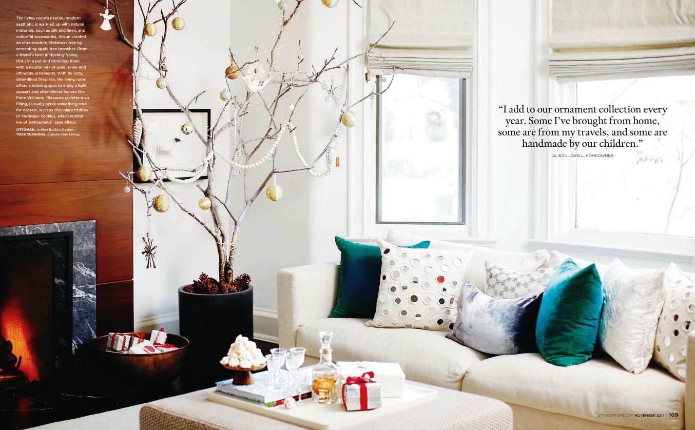
Alison Lovel's Swiss traditions influence her holiday decor. Below, she created a modern Christmas tree by cementing tree branches in a pot and decorating them with a neutral mix of gold, silver and off-white ornaments. I've always been a fan of non-traditional Christmas trees and love the look of this


Alain Doom and Chip Hamann are an Ottawa couple who had designer Irene Langlois help design their space. I love this shot of the dining room! Irene used leftover marble tiles (from another reno in the house) to create a new surround for the fireplace. The mantle is beautiful!  The home owners found these vintage Charles Hollis Jones chairs online. I love that they have translucent legs and they pair very well with the pedestal table. The wall colour is also fantastic - it's a warm gray called Sandy Hook by Benjamin Moore.

In this home, designed by Maureen Sanbord, she integrated the large appliances into the overall look of the kitchen to make them as discreet and seamless as possible. I love what they've done to the range hood in the picture below. The cabinetry, in general, is beautiful and I love the subway tile backsplash.

Good news in the world of kitchens: Updating kitchens and bathrooms can be very costly, and are usually the most expensive home renovations. If you already have structurally sound cabinets, a product like this (and maybe some new hardware!) might go a long way in giving your kitchen an updated look. I've heard it over and over again that the easiest and least expensive way to update a kitchen is to paint out the cabinets white and give them new hardware.
 

And finally, I love this napkin ring. It looks so DIY-able! I see a project like this in my future :-)

Wednesday, October 19, 2011

Canadian House & Home - November Roundup

November's Canadian House & Home issue was the 25th Anniversary Issue and discussed the changing design trends from the 80's to now. Some of the images from the 80's were hilarious - very matchy matchy with lots of peaches, dusty roses, and baby blues....Yikes! Now it is much more current to mix and match separates.
 

Also, it looks like we're spending way more on renovations now than we did when the magazine was first launched in the mid-80's. I wonder where all that money was going before...
 

I was very surprised to learn that Toronto isn't the most condo saturated city in Canada. British Columbia has the top four condo saturated cities with Vancouver, Abbotsord, Kelowna and Victoria leading the pack. I can't even imagine a city that has more condos than Toronto...


I saw this ad for carpeting and I love it. I love neutral berber carpeting. I've been trying to convince Kevin that we should go the carpet route in the bedroom in the condo, because it's so much warmer and quieter (and less $$$!) I don't think he's quite sold on it yet.

Carpet One
The following images are from a show home in Calgary, Alberta that were designed by James McIntyre. I love his style! Simple lines, neutral colours, minimalist.... just my style


Related Posts Plugin for WordPress, Blogger...