Showing posts with label decor. Show all posts

Tuesday, July 17, 2012

Craigslist Find: Storage Ottoman

A little while ago I was on the hunt for a coffee table for my apartment. My search led to a pretty sweet, custom-made ottoman with built in storage. Score! $50 later and it was mine.

Storage Ottoman
What I love most about it is how versatile it is. The top is hinged, and has a very spacious storage space inside – I use it for extra throw pillows and blankets.

The colour and height are close to that of my love seat, so if I’m having a lazy TV-watching day (which is pretty much every Sunday), I can push the two pieces together creating a double loveseat chaise. I have been known to sleep out in my living room on this makeshift “chaise” on more than one occasion :)

With the addition of a tray (I got mine for 50% off at Indigo), it could be used as a coffee table/foot rest – this was actually my original intention, but I didn’t like the way it looked in my living room. I think a more petite/slender coffee table would look better in here.

I currently have it pushed up against the wall, opposite my love seat. I use it as extra seating and with the cushions along the back and the one on the side, it’s pretty inviting! People always tend to gravitate toward that seat. I currently have a tray on my ottoman – contents include 10 or so home/health mags, a candle oil diffuser thing, and a plant that I bought from Ikea 2 years ago. Side note: It came in the tiniest little pot and I’ve re-potted it two times! That plant is down right flourishing in my care and I could not be more proud!! 

Emily-Jane

Tuesday, March 27, 2012

DIY: Recovering Bar Stool Seats

My parents’ house has a breakfast bar off of the main counter in the kitchen. My mom bought some clearance bar stools for the area, but didn’t like the fabric on them, so she recovered them. The stools are 12 years old now, and the fabric has worn away in some areas, so my mom wanted to recover the seats with new fabric.
Here is the before picture. I know the fabric is pretty dingy-looking now, but I actually really like the colours in it.
IMG_1148
Here’s the “wear” I was talking about… and this is one of the not-so-bad areas. One of the bar stools get sat on a lot more than the others and had a big ol’ flap of fabric hanging open on it.IMG_1150
Note: the cats in my parents house love these stools… Riley in particular. So when my dad removed the seat tops, we got to witness Riley jump up on the bare metal square. She looked horrified. I don’t know what she was trying to do, but it was hilarious. I mean, c’mon, Riley! Just look at it… that can’t be very comfortable.IMG_1153
After yanking out dozens of staples to remove the old fabric, we were left with this. We kept the old fabric in place. In the photo on the right, the seat isn’t actually attached, I just placed the seat on the square in the picture above. There was thin black poster-board type paper that originally covered the bottom of the seats and my mom managed to retain it in good shape when she recovered the chairs in 2000. This time the poster-board circles didn’t quite hold up. I advised her to get some new poster-board from Dollarama, then use an old poster-board circle as template to draw a new circle. Worked like a charm

IMG_1154IMG_1151


The new fabric my mom chose isn’t really my cup o’ tea. The colour is very similar to the original fabric, but it’s got a swirly design on it.  I probably would’ve chosen  a grey (or other neutral) graphic print. IMG_1189
Here’s the finished product! She’s very happy with it. Another side note: My mom bought 2 of these stools in black, but the third one was originally gold. She spray painted it black and I had NO IDEA it was ever another colour. Oh the magic of spray paint...IMG_1187
Have you ever recovered a seat? It’s not as hard as it looks!

Friday, March 2, 2012

Mini Bathroom Makeover

My bathroom is black and white, configured strangely, and windowless. I wanted to inject a bit of colour, but I didn’t want to overwhelm the small space. I bought a cute wall decal (from Dollarama…gasp!) not too long ago thinking it would be a great non-permanent way to bring in that colour I wanted.

Here’s what I was working with before. The square footage is small, but the bathroom has 9-foot ceilings and a soaker tub, which is most definitely appreciated.

SDC11225

This is the decal I bought. It only cost $2 and says it doesn’t leave any residue, so I figured it was worth a shot even if it didn’t turn out the way I wanted. This is the only picture that shows the real colour of the decal. Unfortunately, due to the lack of window in the bathroom, the rest of the photos are taken under florescent lighting (CFL bulbs) so the colours look a bit yellow and washed out.

SDC11235

It was super easy to stick on the wall. I stuck the sections on exactly how they’re shown in the example photo on the packaging

SDC11257

I also styled the top of the medicine cabinet with some items I already had and some super discounted items I recently bought at Indigo.

Bathroom Medicine Cabinet Decorations

Here is the before and after – the view is from the door. It makes me happy to see some colour in here when I walk in

Bathroom Medicine Cabinet Decorations1-001


Have a great weekend and make sure to check back on Monday – I’m doing my first giveaway!

Thursday, February 23, 2012

CB2

I recently ventured to CB2, Crate&Barrel's younger, hipper, and (relatively) cheaper counterpart. CB2 opened their first Canadian store at Queen and Bathurst in Toronto on January 20, 2012. The 2-story store is actually a heritage building that was built in the 1800s. Most Torontonian's are familiar with the building in its previous state - purple, and lots of it. CB2 spent $3 million restoring the exterior of the building to its original beautiful state, which involved stripping the brick of the purple and gutting the interior, but they did keep a few pieces of nostalgia, most notably The Big Bop sign hanging in the stairway to the second floor (you can see it on the top right photo)
Photos sources clockwise from top left: 1/2/3/4
The store was packed when I visited and was stocked full with new spring 2012 collection. There were lots of bold colours as well as neutrals to round them out, and I noticed a pretty heavy Scandinavian influence - simple lines and natural woods.


Here are a few items that caught my eye:

I loved these plates - the salisbury steak one for my meat-loving man, and the tofu steak one for me :) The white bookshelf is also great. Kevin and I have been eyeing the Expedit unit from Ikea, but this one has some potential too...


Have you checked out CB2 yet?

Thursday, December 15, 2011

My Christmas Decor Inspiration

Christmas decorations are so varied. Some people stick with simple whites, silvers, and golds, while others will use practically every colour under the sun. I grew up with my parents decorating the house with a real tree, multi-coloured lights outside and in, wreaths, garlands, tinsel, Santa figurines... you name it, we had it. I guess you just kind of accumulate a lot over the years and probably go for it a little more, decoration-wise, when you have young kids who still believe all the magic that Christmas brings. By the way, the jig was up when I was 8 and I saw my parents in the living room wrapping presents. They weren't even trying to be sneaky anymore! Seriously, I'm so gullible, they could've kept that charade going for at least a few more years...

Anywhooo, I thought I'd share some inspiring Christmas decor images that I found on Pinterest :-) My style is definitely falls into the more subdued, maybe even abstract side of Christmas decorating.

Tree:
If I had to have a traditional tree (be it real or fake - I have no preference), I'd decorate it like this. I love the white and silver decorations, the sheepskin rug underneath, the green and white palette for the wrapping paper. I even love how the tree seems kinda droopy
[via]

If I didn't have the space and Kevin didn't object, I'd do something like this. I love the simplicity of it!
[via, clockwise from top left 1,2,3,4]

Wreaths:
I love wreaths. When I see one on someone's front door, it kind of sets the tone for what I should expect for the interior decor. Here are some non-tradition wreaths I scoped out:
[via 1,2,3,4,5]


General Decor:
All the other little touches around the house are what help to create that Christmas-y feeling.
[via 1,2,3,4,5]


Do you go more traditional or more modern with your Christmas decor? 

Friday, November 25, 2011

Style At Home - December Roundup

I'm loving the December issue of Style at Home! It's filled with stylish interiors and great Christmas DIYs. If you love the holidays, go out and get this issue for some great inspiration!

Here are some great dining rooms. This first one belongs to Tamara Robbins Giffin. I love the wall treatment. They don't list what it is, but it looks like grass cloth(?). Correct me if I'm wrong! I also love the over sized black pendant light and the walnut stained table.

This second dining room belongs to Amanda Faber-Gidge and was designed by Stacy McLennan. There isn't one thing in this room that I don't like! The silver ball wreath, the fireplace, the carpet, the sparkle...all good. The house is done up in white and grey, which keeps it fresh. My favourite part is the white chairs with the Eiffel tower bases paired up with the rough texture of the dining table - rustic meets contemporary!

Every year at Christmas, I bake gingerbread and shortbread cookies for my family, friends and co-workers. I always use Christmas decorated tins from Dollarama and line them with parchment paper. This year I think I'm gonna go with one of these ideas instead!


In case you've just joined my blog, I'll fill you in: I'm a little bit obsessed (is it possible to be a "little bit" obsessed?) with banquettes! I luuurve them! This one is so sleek with the dark tapered legs and overall classic design. It's also customizable to four or six feet and comes in a choice of different fabrics. Something like this would look great at a dining table or in an entryway. Very versatile


And I'm throwing this in for good measure. I come from a family of avid readers and feel like my sister especially, would enjoy bookends like this.

I hope all my American readers had a fantastic Thanksgiving yesterday and enjoy their long weekends. For those of us to the north and elsewhere in the world, have a great (regular) weekend! One month until Christmas!! Have you started shopping yet??

Wednesday, October 26, 2011

Style At Home - November Roundup

The November issue of Style At Home is about easy holiday style. Sign me up! Christmas is the one holiday where my family goes all out so I really look forward to it each year. This issue had some great home tours and ideas for holiday decorating! Here is what caught my eye. 

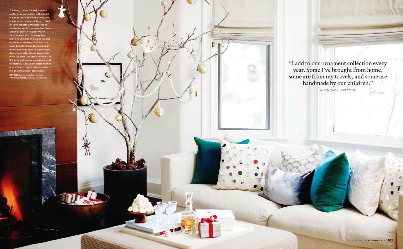
Alison Lovel's Swiss traditions influence her holiday decor. Below, she created a modern Christmas tree by cementing tree branches in a pot and decorating them with a neutral mix of gold, silver and off-white ornaments. I've always been a fan of non-traditional Christmas trees and love the look of this


Alain Doom and Chip Hamann are an Ottawa couple who had designer Irene Langlois help design their space. I love this shot of the dining room! Irene used leftover marble tiles (from another reno in the house) to create a new surround for the fireplace. The mantle is beautiful!  The home owners found these vintage Charles Hollis Jones chairs online. I love that they have translucent legs and they pair very well with the pedestal table. The wall colour is also fantastic - it's a warm gray called Sandy Hook by Benjamin Moore.

In this home, designed by Maureen Sanbord, she integrated the large appliances into the overall look of the kitchen to make them as discreet and seamless as possible. I love what they've done to the range hood in the picture below. The cabinetry, in general, is beautiful and I love the subway tile backsplash.

Good news in the world of kitchens: Updating kitchens and bathrooms can be very costly, and are usually the most expensive home renovations. If you already have structurally sound cabinets, a product like this (and maybe some new hardware!) might go a long way in giving your kitchen an updated look. I've heard it over and over again that the easiest and least expensive way to update a kitchen is to paint out the cabinets white and give them new hardware.
 

And finally, I love this napkin ring. It looks so DIY-able! I see a project like this in my future :-)

Friday, October 21, 2011

Decor at Jedd's Frozen Custard

Gary and I went to Jedd's Frozen Custard on Thursday night with a group deal coupon in hand. We each ordered 2 scoops of frozen custard - one vanilla and one chocolate. Being from England, I've had many many many custards in my life, but this was the first time I had frozen custard. It was delicious. Jedd himself was serving us and told us a bit about how the custard was made and said the chocolate wasn't as "chocolately" as normal that day, but that was fine by me - I actually really liked that it was a light chocolate flavour instead of intense chocolate. 

{via}

Anyway, while Gary and I were eating our dessert, I was checking out the place... Before we walked in I noticed how crisp the black and glass store front is, and then once we walked in, I immediately noticed that all of the counters and bistro tables were marble - beautiful!
{via}..and slightly altered

As we were eating I started to notice all the other great little touches: the cabinets were espresso-coloured with chalkboard fronts that displayed the menu options...
{via}

There were a few glass tile walls and fantastic chandeliers
{via}
The radiator had a cool cover on it and even the bathrooms were great!  They had the same design elements as the rest of the place so everything flowed nicely. Jedd said he designed everything himself and I think he did a great job

Unfortunately my camera charger broke and my battery is dead (I've ordered another charger!) so I didn't have my camera with me and grabbed these pics from online. They don't do the place justice!

Tuesday, October 4, 2011

Toronto Fall Home Show 2011

EI EI Home offered up two tickets for the Toronto Fall Home Show to me and the ol' bloggo, so my buddy Gary and I headed on over last weekend.


Gary was impressed that my tickets got us through the VIP Entrance (psst: every attendee was a VIP)

One thing I was definitely interested in checking out while at the home show was window coverings. The condo that we're moving to next year has 2 complete walls of windows - a long wall facing east (the bedroom, den and living room) and a short wall facing south (the other side of the living room and the kitchen).

We came across a Hunter Douglas booth with some pretty cool shades. These Duette Honeycomb shades had my attention for a good 20 minutes. I'd never seen shades like this before... I've also never gone shopping for window coverings either though, so take that with a grain of salt. After a bit of research online, I can tell you that these types of blinds are called cellular or honeycomb. The reasons I thought they were awesome is that:
a) they have a cordless lift option so the blinds can be positioned by hand (When Riley was a kitten, I once found her hanging from the cord of my blinds in my first university apartment. Needless to say, but cords are dangerous yo!)
b) they were top-down/bottom-up (hehe saying that makes me laugh every time) so you can pull them down from the top or pull them up from the bottom. 
c) the ones on the left had a sheer portion on top and a blackout portion on the bottom (perfect for a bedroom!)

This picture shows what the sheer part looks like for the shade on the left

These blinds would be $$$ and the option I had in mind and am still considering for window coverings is what Anna from Door Sixteen has. She used the ENJE roller blinds from Ikea and they look great. So clean and minimalist. I think they would be a great option for the living room/den/kitchen, but I would definitely need a more opaque option for the bedroom. I literally cover up every single source of light when I go to sleep. Light drives me nuts when I'm trying to doze off.

On another note, Gary and I also checked out some cool storage options while at the home show. This above-sink storage option immediately caught our attention. It uses an internal mechanism that counters the weight so it is easy to pull down and lift up.


This was a nicely decked out pantry. I imagine this would be easy to keep organized because everything is in plain view.


And we saw lots of options for bedside tables for beds with storage underneath!

This one would be pretty easy to make... I think

This one has more storage potential with the drawer. And I think it had integrated lighting in the headboard.. very cool.

Did you go to the Home Show? Find anything interesting? Did you get the bread pudding mix?? I may or may not have taken three packages...

Thursday, September 1, 2011

Favourite Nooks

I had two favourite areas in my apartment: The view from the living room door and the view from the bed. 

I loved the  view from the living room door because I got to see my pretty mirror (a Craigslist find) and my shelf (the very first thing I ever spray painted) with the candles and bamboo plant (that Kevin gave to me when I started my current job).

I loved the view from the bed because I could see the lamps (Craigslist) with the shades I recovered, the French provincial dresser (Craigslist) that I painted (in the tiny bedroom and it took me days), the lamp shade that I bought from Ikea and added to the gross brass wall light fixture (that I spray painted black) and the French door (Craigslist) that my Dad helped install and cut a thin strip from because our door frame is crooked.

Unfortunately, I never did take a picture from that angle - but I sure did appreciate it while lazying around in bed on the weekend :-)

These areas will be missed!

Do you have an area in your house that makes you smile or that you're proud of?

Monday, August 22, 2011

Condo Shopping with Michelle

Michelle recently got a permanent full-time job (congrats!) and as such, has been keenly researching condos so she can move out of my parents' house. Michelle's a librarian so she's an extremely thorough researcher - she's got a spread sheet of condo prices, payment structures with varying interest rates, etc. This weekend, my mom and I went with her to various condo sales offices. A couple of them were busts because they were sold out (but didn't say so on their websites...), but we got some very helpful information at the Fuse Condos sales office. We were actually looking for the Upside Down condos sales office, but stumbled in to the Fuse office and decided to check it out. Turns out Upside Down condos is the same builder so we were in the right sales office all along. 


I like checking out how the condo model suites are staged because they always use reflective or glass elements, along with smaller scale furniture to make the rooms appear larger.


Here was the floor plan of the model suite they had in the sales office. It's 794 square feet with a 116 square foot balcony, and as you can see it's a 2-bedroom unit. All the finishes in the unit are standard.
I took pictures of the common areas, the master bedroom and master bathroom.

Here's the kitchen and dining area. The table was small, but nicely set up. The kitchen looked  good, but obviously if you've seen any kitchens I like (such as here or here), you know I love white cabinets. My mom and I both agreed that white cabinets would've been the right way to go here because it really would've brightened up the space. 
 This nook is cute! It reminds me of the nook in my current apartment, where we have our desk and wine rack. These mirrors remind me of the mirrors I got from BB Bargoons. This image is definitely going in my inspiration folder!


I wasn't a fan of the furniture or colour in the living room, but I like that the coffee and side tables have mirrored tops. It's a great way to bring light in to a room.  


The bedroom was very well sized for a condo - something like 10x12sq ft. I like the furniture, but again, not a fan of the colours...


The bathroom was nice. Soaker tubs are pretty standard now with new builds, which is pretty awesome.

Have you seen any nice condo model suites lately? I'll pass on any suggestions to Michelle. 

Wednesday, August 17, 2011

Canadian House & Home - September Roundup

The September issue of Canadian House & Home focused on small spaces - a topic with which I am very familiar! I love looking at how other people function in smaller spaces, so this issue was a treat for me.

This kitchen is from a Muti Kitchen & Bath ad and it. is. GORGEOUS! I love everything about it! Except I would have liked to see full-sized cabinets flanking either side of the sink against the wall to the right...but other than that it's perfect! It's pictures like this that I want to bring in when I'm picking out the condo finishes. Kevin already told me I can pick out anything I like, which makes me very happy because he likes everything dark and I like everything light.

Another obsession of mine is banquette seating. I think they're beautiful, space saving, and conducive to intimate casual dinners with friends. I really hope it's something we can incorporate into the condo. The homeowner, Sarah Callahan, did a great job on accessorizing this space. I love the mix of fuchsia, olive, black and white pillows! The lighting fixture, from Ikea, is the same one John and Sherry have in their bedroom on Young House Love. While I love the way it looks in pictures and love the shadows it casts on the walls when lit, I don't like the way it looks in person. For me, it's definitely a love-from-afar fixture.

Daybeds are great space savers. This first one here (2.) is more what I would consider a chaise and the last one (7.) is more like a comfy bench, but they're practically cousins to the daybed, hence why H&H included them in this Bed & Beyond article. Daybeds are great because they can double as a bed for your (shorter) overnight guests. The shortest one here is 71 inches (just under 6ft), which I (at 5'4") would have no problem sleeping on. Daybeds can also be used as room dividers. They have low/no backs so they don't block off spaces as harshly as the back of a traditional couch would. A daybed can also seat more people because you're able to sit on all sides of it.  


I don't know how things are in your neighbourhood, but around here, garbage/green/recycle bins are a real eyesore. The space between Toronto houses can be quite tight, so many people store their bins in front of their houses. A storage bin like this is a great solution, although this exact model is pricey... probably worth a DIY attempt!
Do you have any space saving solutions you'd like to share? I'm all ears!


Related Posts Plugin for WordPress, Blogger...